Using Visual Composer to construct your pages
To utilize this theme to the maximum, you need to get acquainted to using Visual Composer.
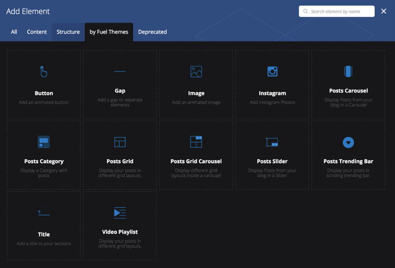
We have added custom Visual Composer Elements on top of the default ones to create unique layouts. You can find these extra elements under the by Fuel Themes tab inside Add Element window:
Most of the elements are self-explanatory, so we ‘ll go over the complex ones to get you started.
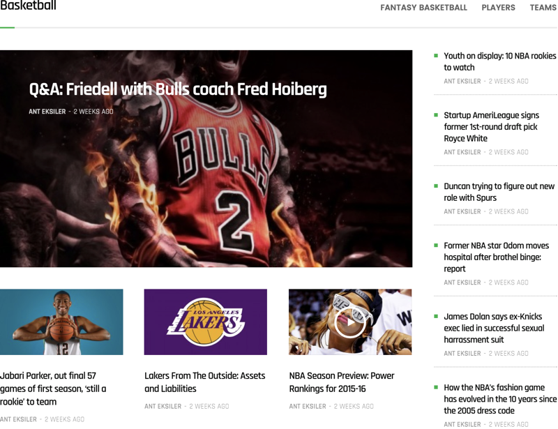
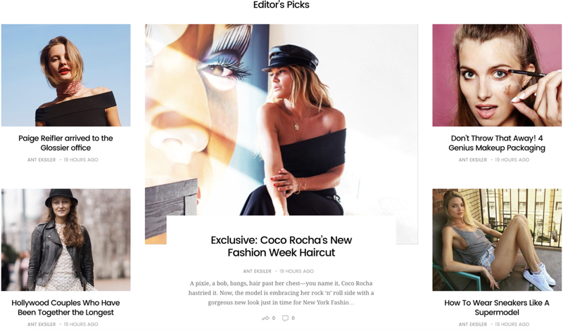
Posts Category
Posts category element is the most used element in our demos. Basically, it allows you to show posts from a specific category. Below you can find the different styles with screenshots below them.
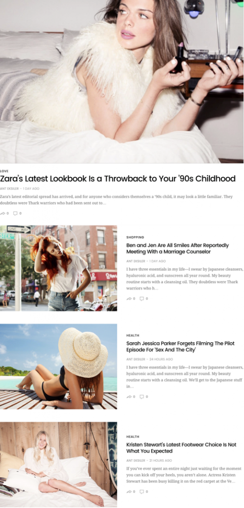
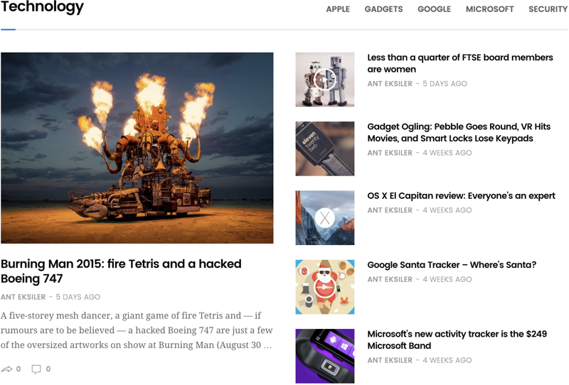
Style 1:
Style 2:
Style 3:
Style 4:
Style 5:
Style 6:
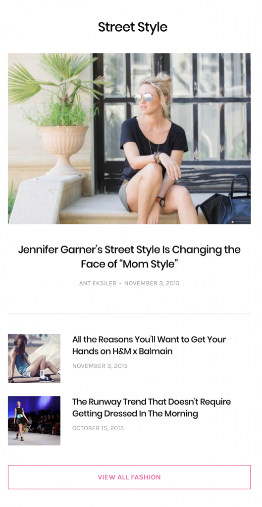
Style 6-Fashion:
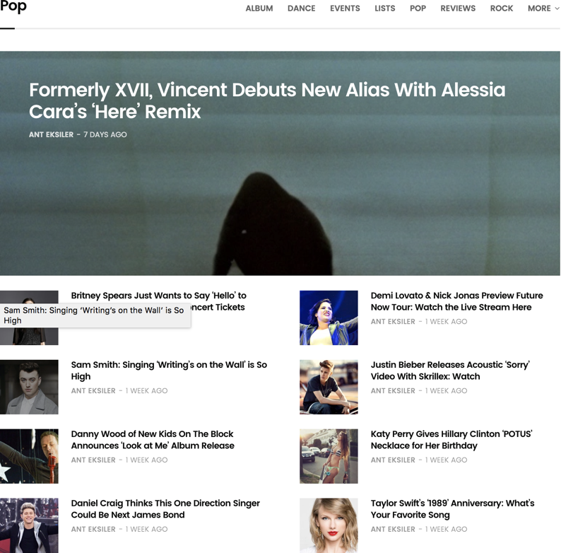
Style 7:
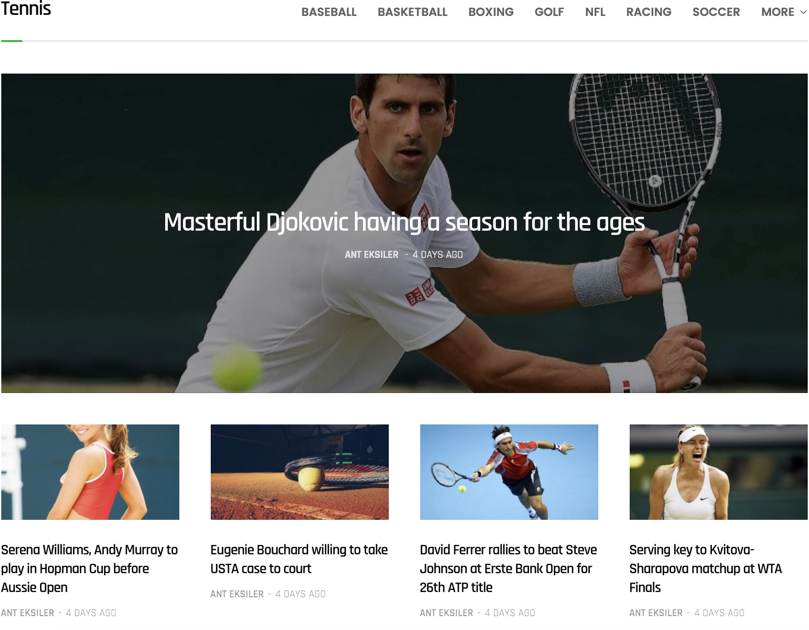
Style 8:
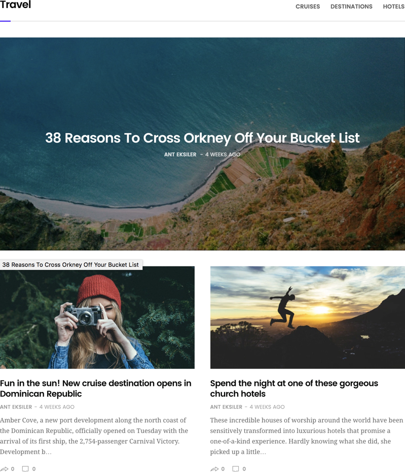
Posts Grid Carousel
Posts grid carousel element is the one that is used on top of the demos that is showing posts in a grid while utilizing a carousel behavior.
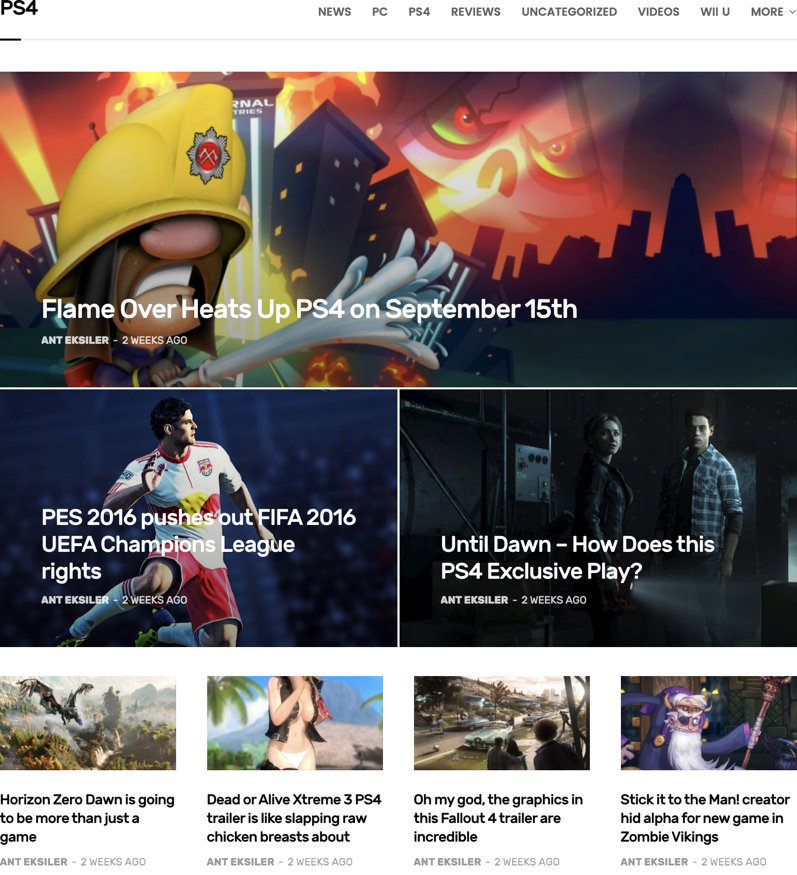
Style 1:
Use post counts in multiple of 3. For example 3,6,9, etc.

Style 2:
Use post counts in multiple of 3. For example 3,6,9, etc.
Style 3:
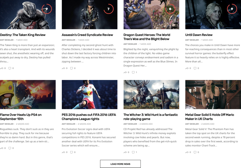
Use post counts in multiple of 5. For example 5,10,15, etc.

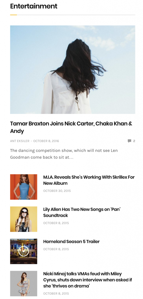
Posts Grids
Posts grids element is the one with the pagination below. You can only have 1 Post Grid with pagination on the same page.
Style 1:
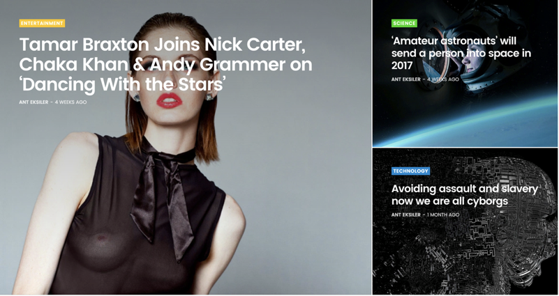
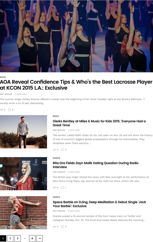
Displays the posts in an horizontal format. This element has a Featured Posts (Enlarged Post Image) setting, which makes the nth post enlarged. For example below, you would enter 1 to make the first post large. You can enter multiple values by separating them using comma.
Style 2:
This style displays the posts in a column based grid layout.
Style 3:
This element has a Featured Posts (Enlarged Post Image) setting, which makes the nth post enlarged. For example below, you would enter 1 to make the first post large. You can enter multiple values by separating them using comma.