Using Visual Composer to construct your pages
To utilise this theme to the maximum, you need to get acquainted to using Visual Composer.
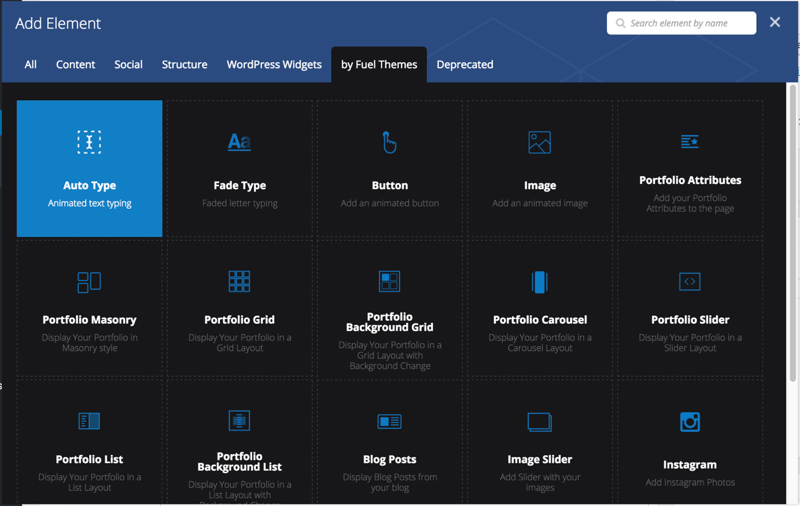
We have added custom Visual Composer Elements on top of the default ones to create unique layouts. You can find these extra elements under the by Fuel Themes tab inside Add Element window:
Most of the elements are self-explanatory, but we ‘ll go over the complex ones to get you started.
Portfolio Masonry
Portfolio Masonry is the most used element in our theme. It allows you to display your Portfolio items in a masonry like layout.
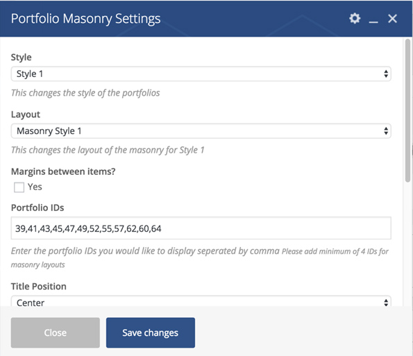
Below, we ‘ll go over different styles so you can pick whatever you need:
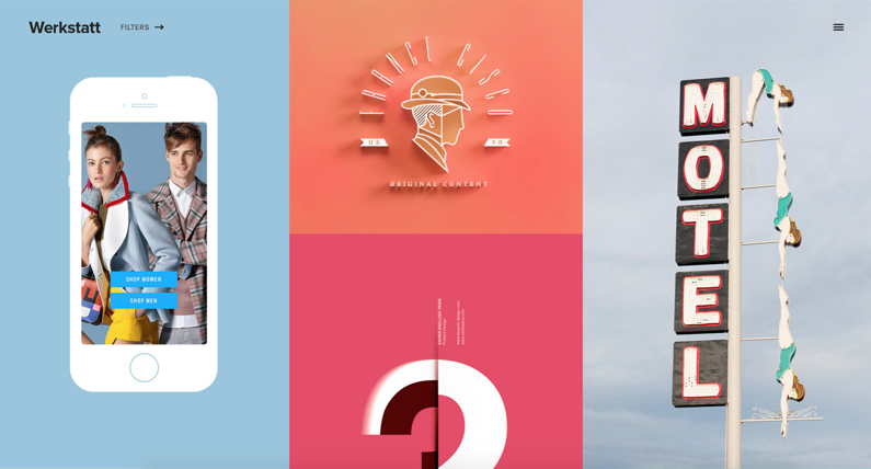
Style 1 – Layout 1
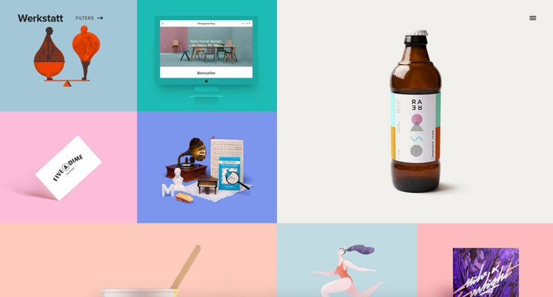
Style 1 – Layout 2
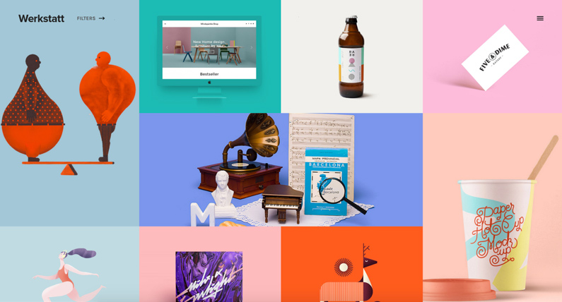
Style 1 – Layout 3
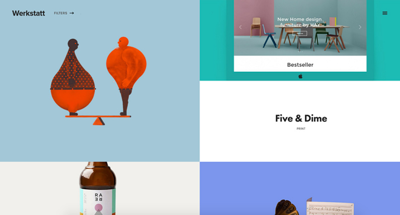
Style 1 – Layout 4
Style 1 – Layout 5
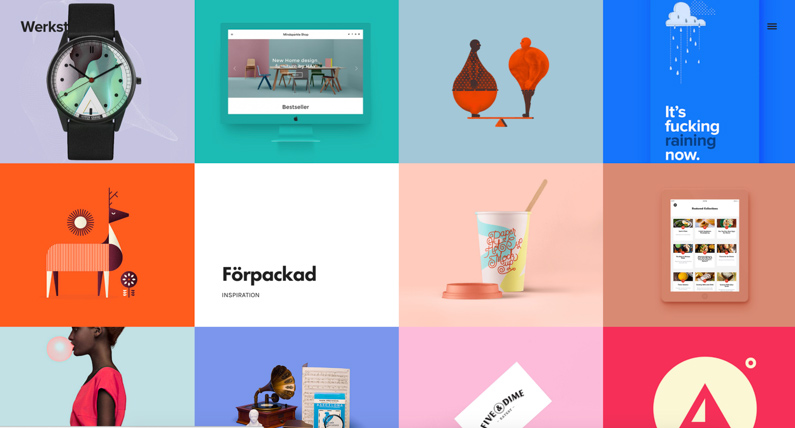
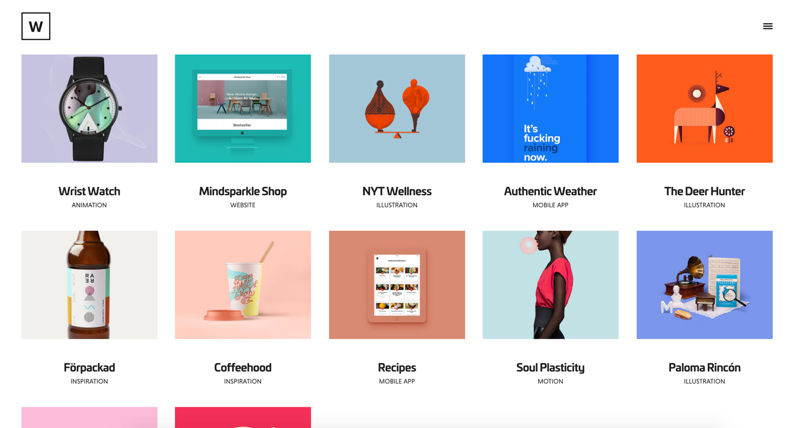
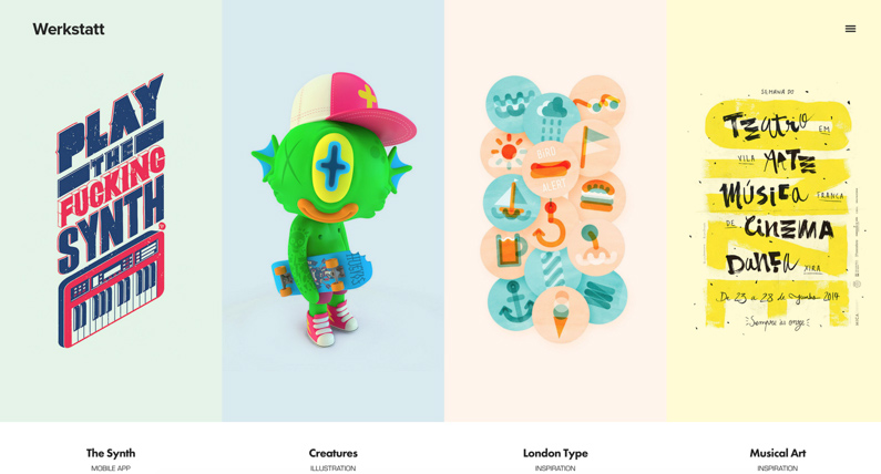
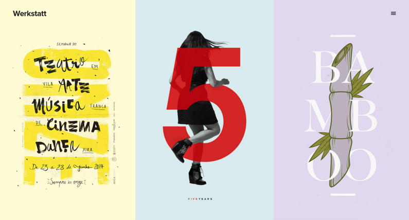
Portfolio Grid
Portfolio Grid uses equal heights for all portfolio items, unlike the Masonry element.
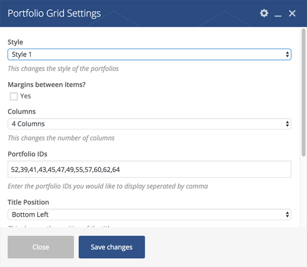
Style 1
This is same as the Masonry Style1, where the titles are displayed over the portfolio items:
Style 2
Same as Masonry Style 2, the titles are below the portfolio items:
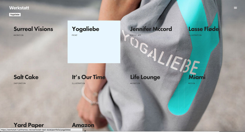
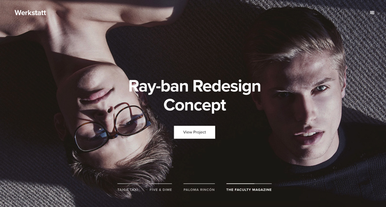
Portfolio Background Grid
This element displays the portfolio items in a fullscreen layout:
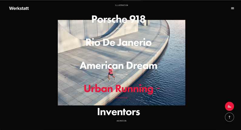
Portfolio Background List
Similar to the background grid, but this element displays the Portfolio Titles centered on the screen:
Portfolio Carousel
This element allows you to display your portfolio in a carousel. It has 2 styles same as previous Masonry and Grid elements, with title below and title over the portfolio item.
And the second style:
Portfolio Slider:
This elements display your portfolios in a horizontal slider.
Portfolio List:
Similar to Background List Element, but the images are on the right: